Home AI Prompts Bookshelf Icon Packs Illustrations Wireframes Inspirations Avatars AI Image Generator Typography AI Tools Framer Portfolio Inspirations Portfolio Builder Stock Images Website Builders Design Blogs Colors 3D Design Systems Motion Design Nice Reads Misc Mockups UI Kits & Frontend Design Softwares
Shadcn UI Registries Guide: Components, MCP Server & Third-Party Integration
Explore Shadcn UI registries for accessible UI components. Learn MCP server setup for AI-assisted installation, third-party registry integration, and building modern interfaces with shadcn/ui framework.
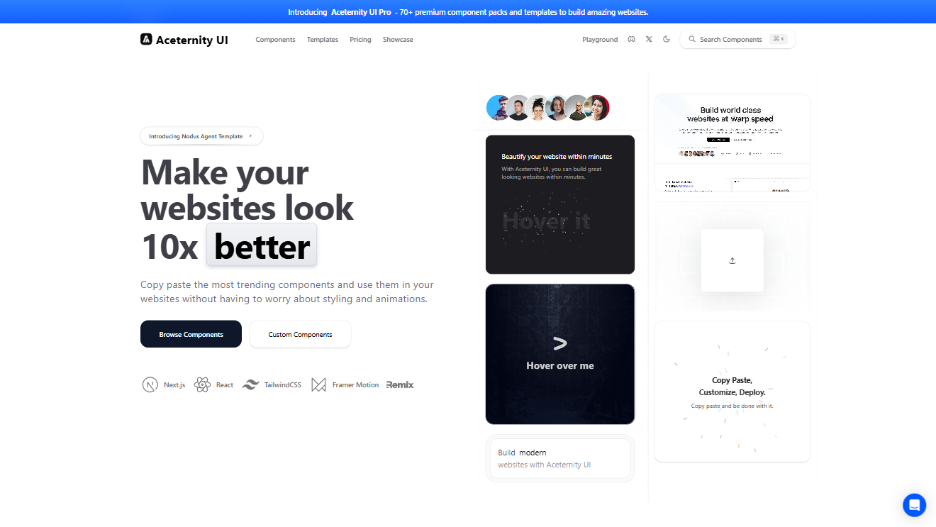
A collection of accessible Radix + Tailwind UI components with animations, templates, AI customization, and lifetime updates.
"@aceternity": "https://ui.aceternity.com/registry/{name}.json",
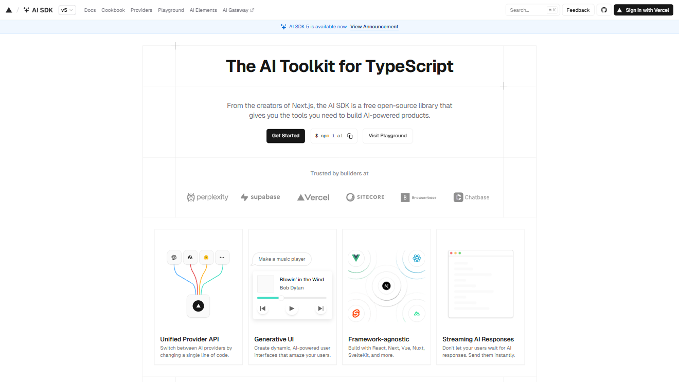
AI-powered UI component registry with smart, composable building blocks.
"@ai-elements": "https://registry.ai-sdk.dev/{name}.json",
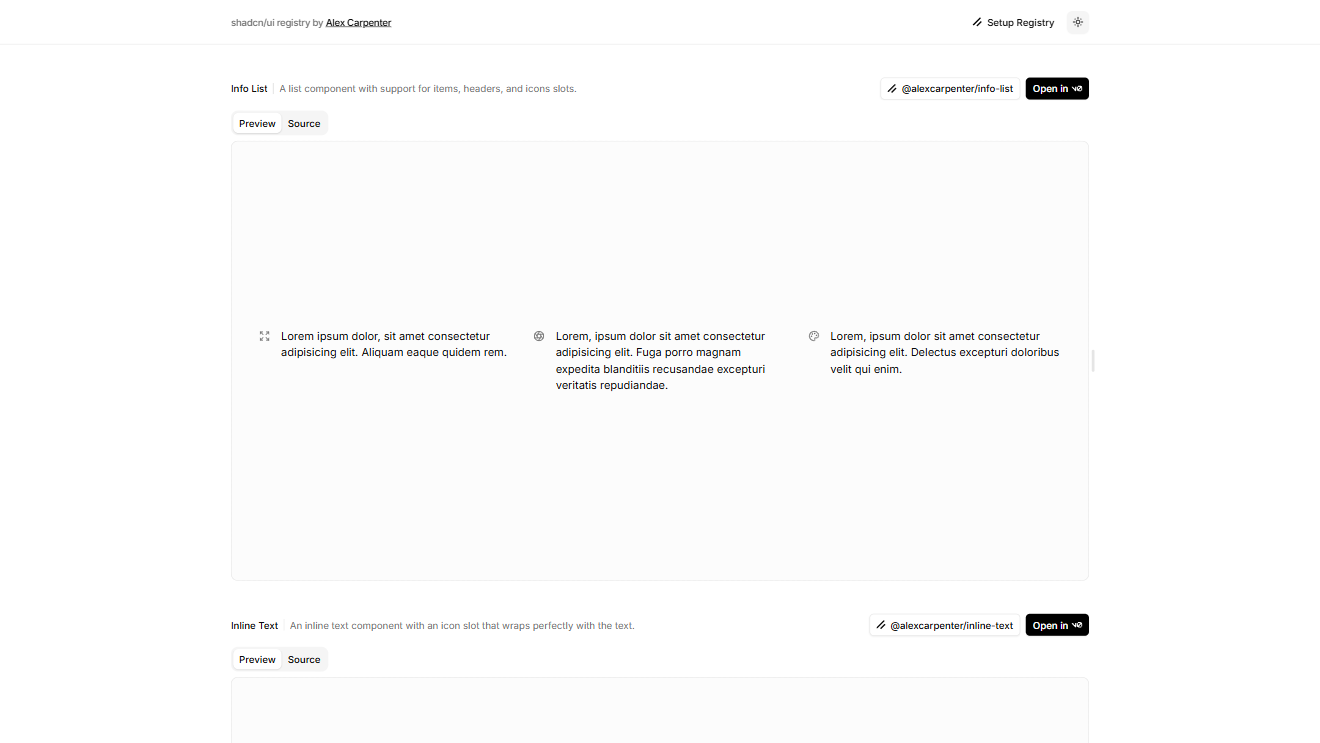
Minimal and clean UI registry by Alex Carpenter for modern web projects.
"@alexcarpenter": "https://ui.alexcarpenter.me/r/{name}.json",
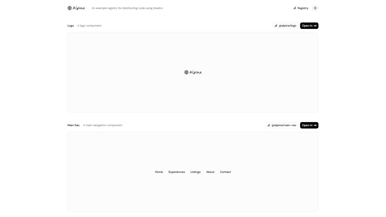
Lightweight UI registry offering simple, composable components.
"@alpine": "https://alpine-registry.vercel.app/r/{name}.json",
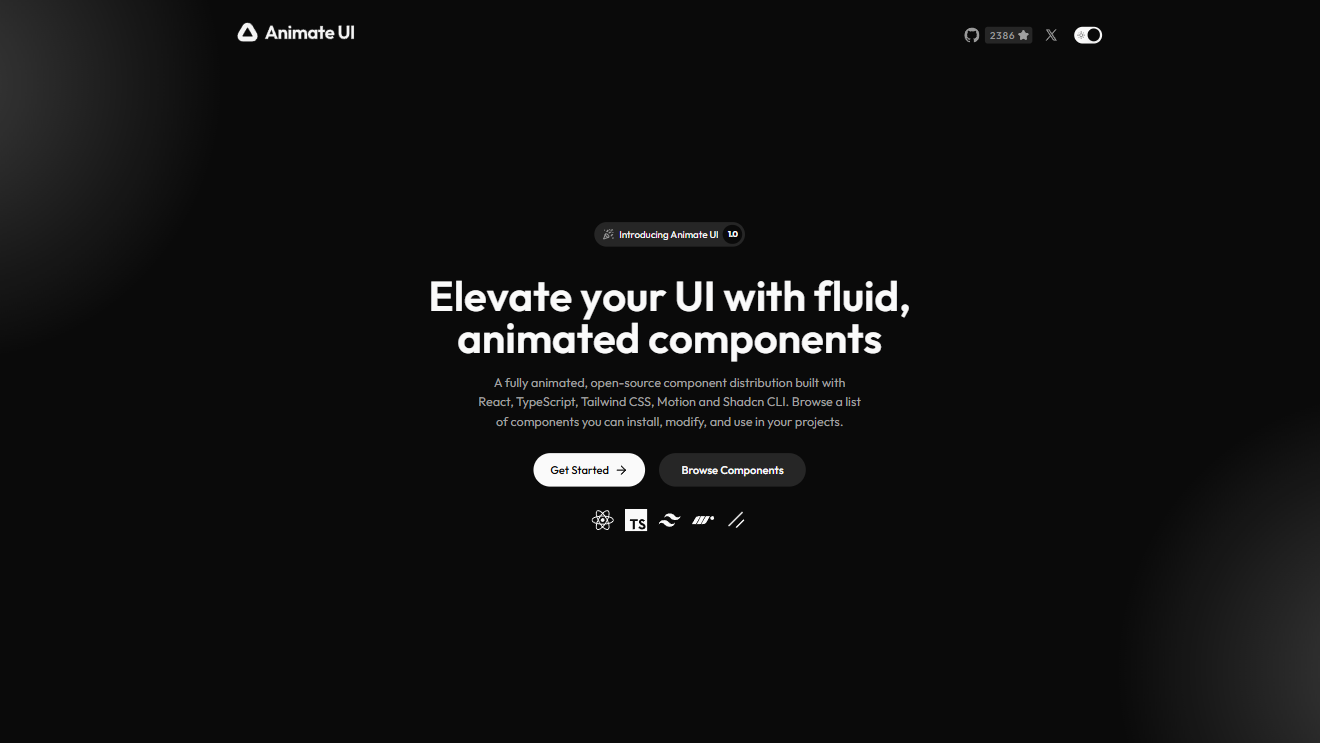
Registry focused on animated, motion-rich UI components for React apps.
"@animate-ui": "https://animate-ui.com/r/{name}.json",

Aceternity UI Pro React UI components library with 70+ premium templates. Build professional websites faster. Used by Google, Microsoft pros.
"@aceternity": "https://ui.aceternity.com/registry/{name}.json",

Magic UI Pro React UI components library with 8+ templates and 50+ sections. Ship beautiful products in record time. Lifetime access
"@magic-ui": "https://magicui.design/r/{name}.json",
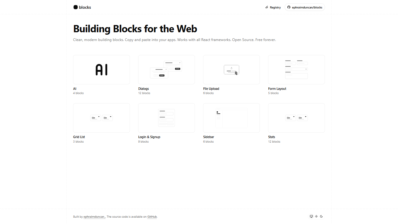
Collection of prebuilt UI blocks designed for fast prototyping and layout design.
"@blocks": "https://blocks.so/r/{name}.json",
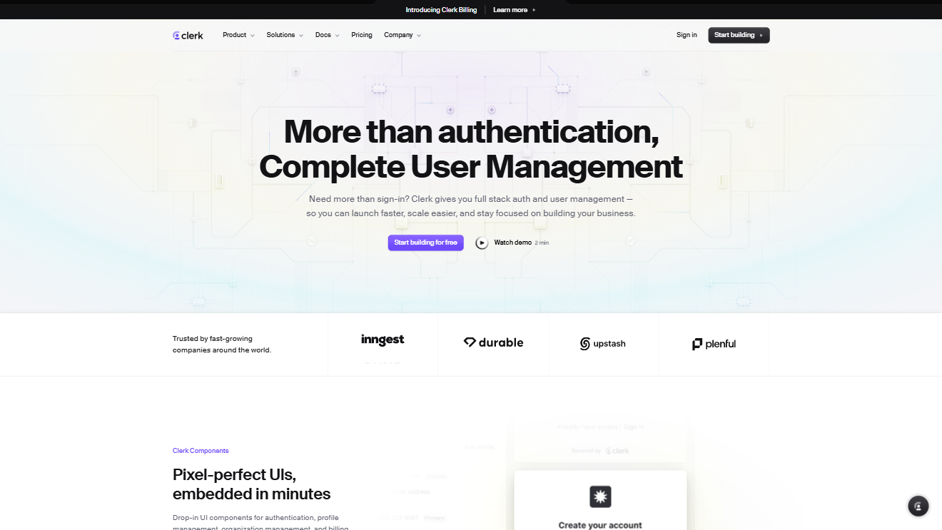
UI components and templates designed to work seamlessly with Clerk authentication.
"@clerk": "https://clerk.com/r/{name}.json",
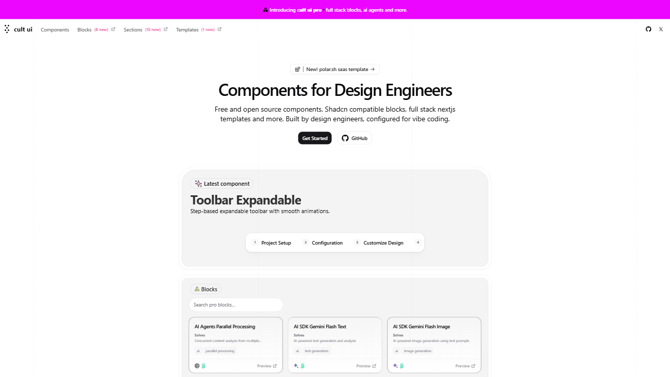
Open-source animated React components with Tailwind CSS, dark mode, and creative templates.
"@cult-ui": "https://cult-ui.com/r/{name}.json",
Free, extensible React + Shadcn UI suite with advanced patterns like Kanban boards and collaborative canvases.
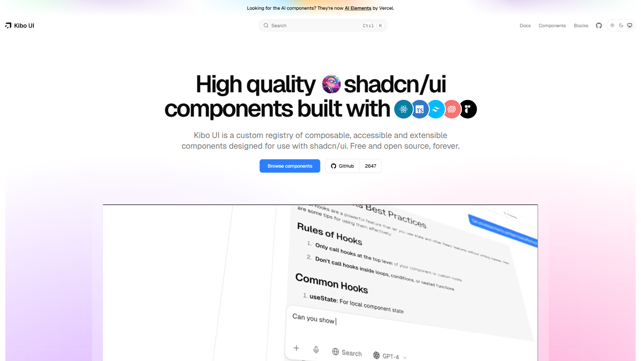
"@kibo-ui": "https://www.kibo-ui.com/r/{name}.json",
Playful open-source registry with 100+ Tailwind + Motion components and smooth animations.
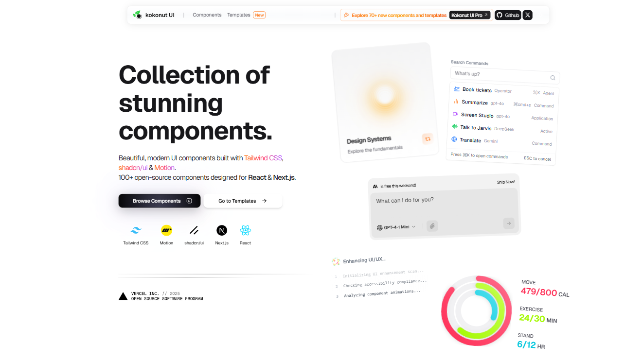
"@kokonutui": "https://kokonutui.com/r/{name}.json",
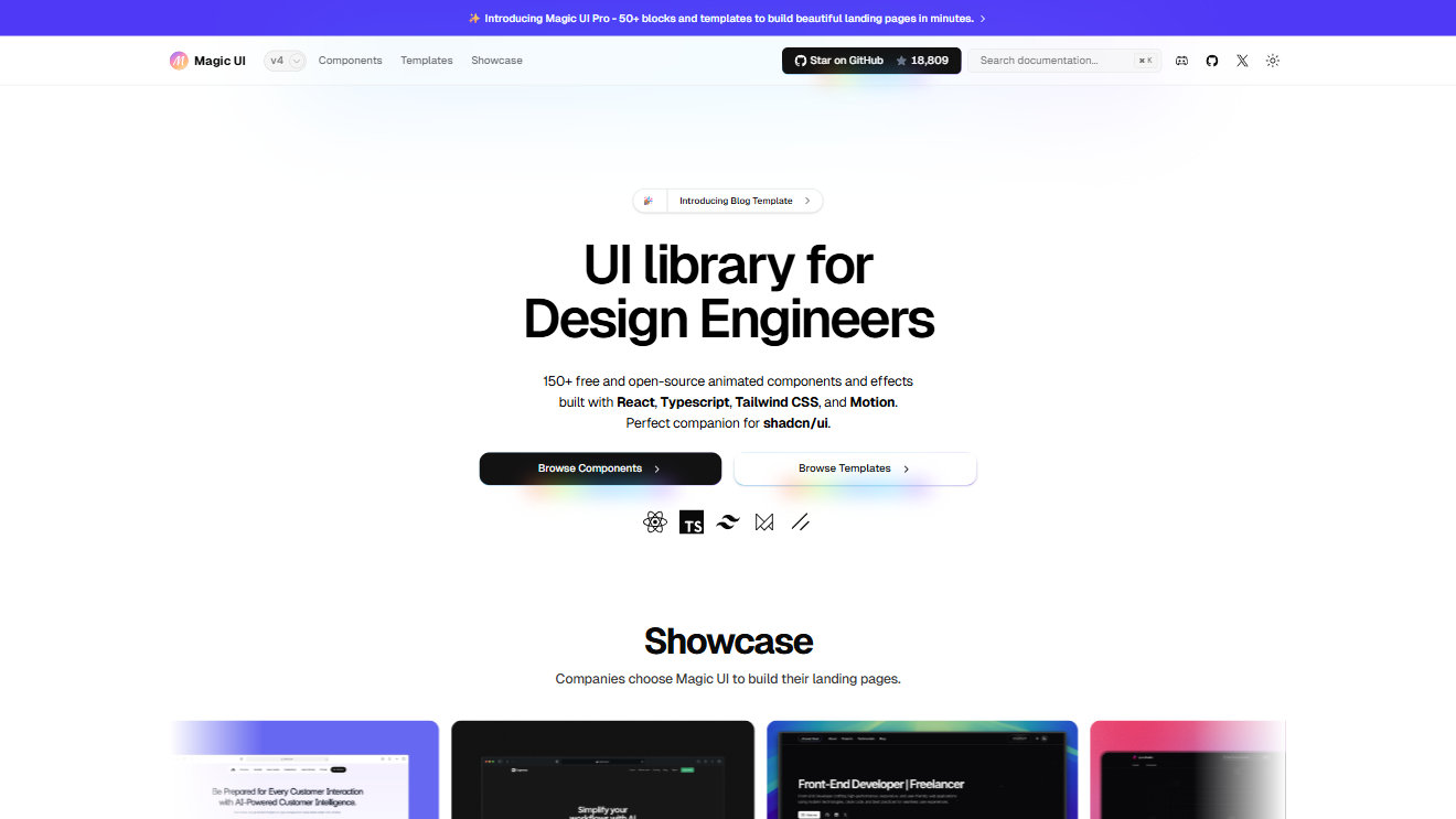
150+ animated React + Tailwind + Framer Motion components for landing pages, startups, and portfolios.
"@magic-ui": "https://magicui.design/r/{name}.json",
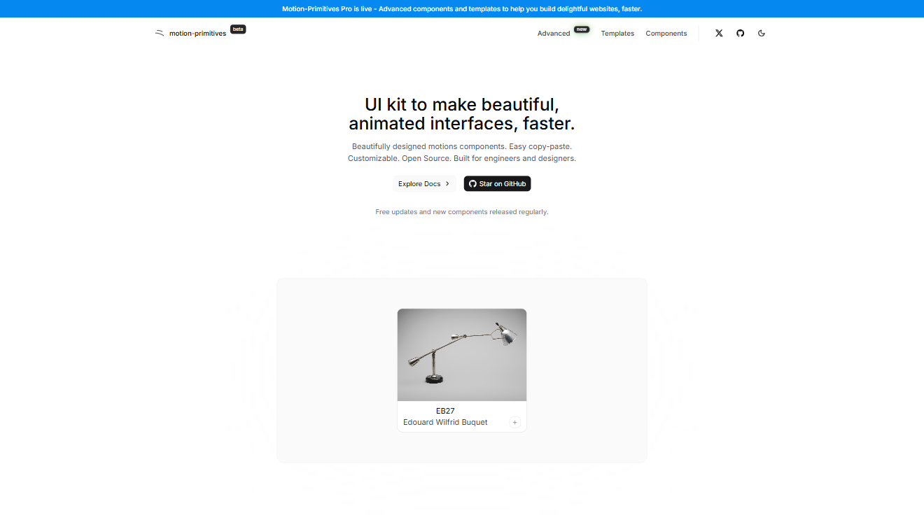
Motion-driven UI components and primitives built for React and Framer Motion.
"@motion-primitives": "https://motion-primitives.com/c/{name}.json",
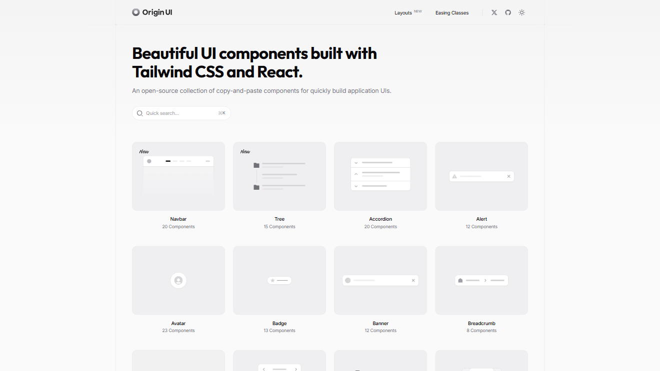
Flexible mobile-first UI kit with clean minimalism, dark mode, and prebuilt templates.
"@originui": "https://originui.com/r/{name}.json",
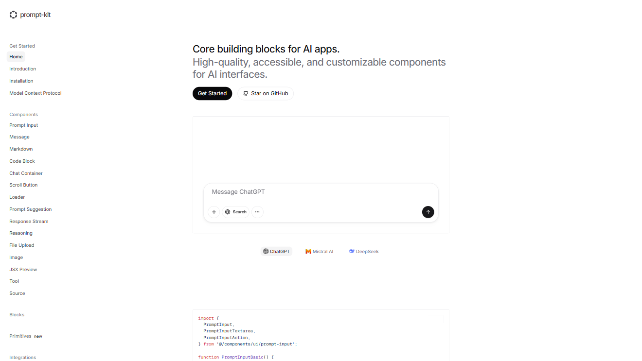
AI-focused UI kit providing ready-to-use prompts and component templates.
"@prompt-kit": "https://prompt-kit.com/c/{name}.json",
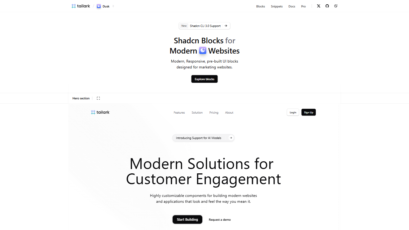
Modern Tailwind-powered UI registry offering reusable components and templates.
"@tailark": "https://tailark.com/r/{name}.json",
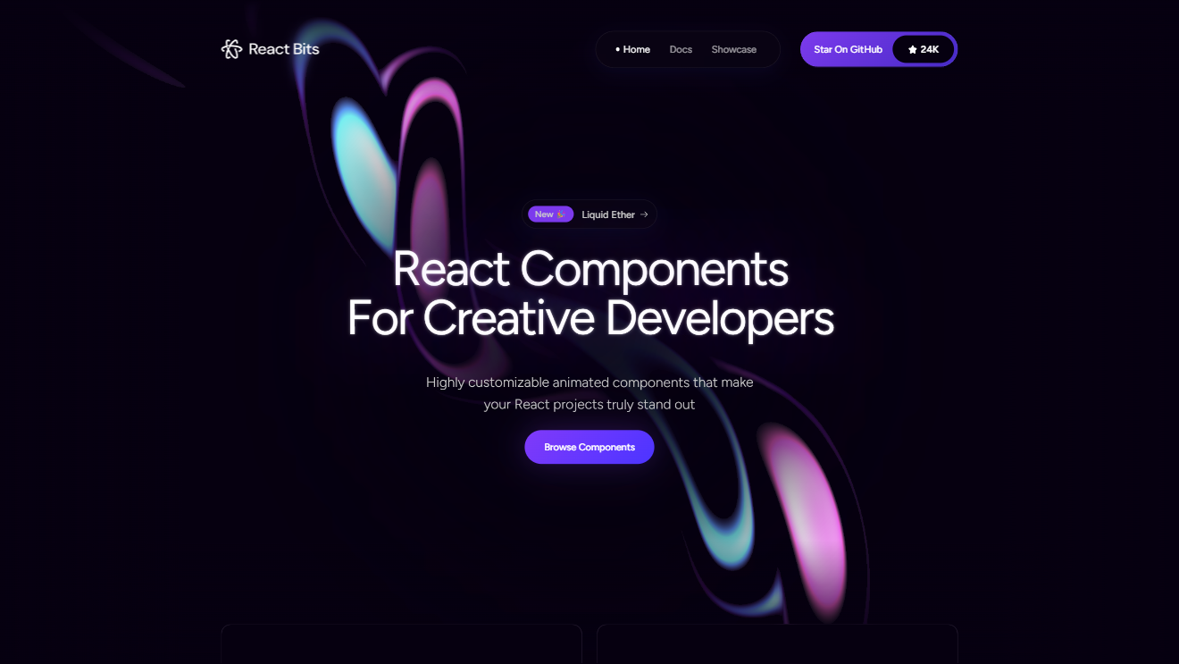
Handy React component patterns and snippets registry for developers.
"@react-bits": "https://reactbits.dev/r/{name}.json",
Reusable Shadcn-style blocks/templates for React + Next.js, boosting productivity.
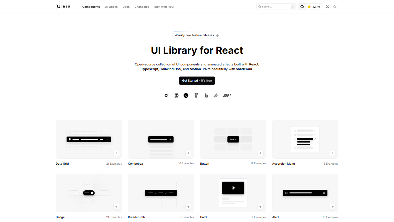
"@reui": "https://reui.io/r/{name}.json",
Shadcn-style UI component registry for building fast, modern React interfaces.
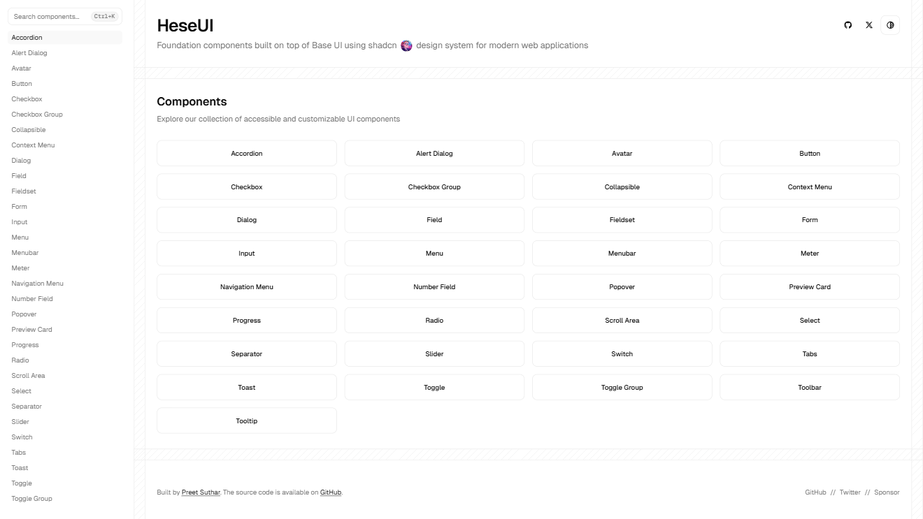
"@heseui": "https://www.heseui.com/r/{name}.json",
Composable, modern UI registry for React with focus on developer speed.
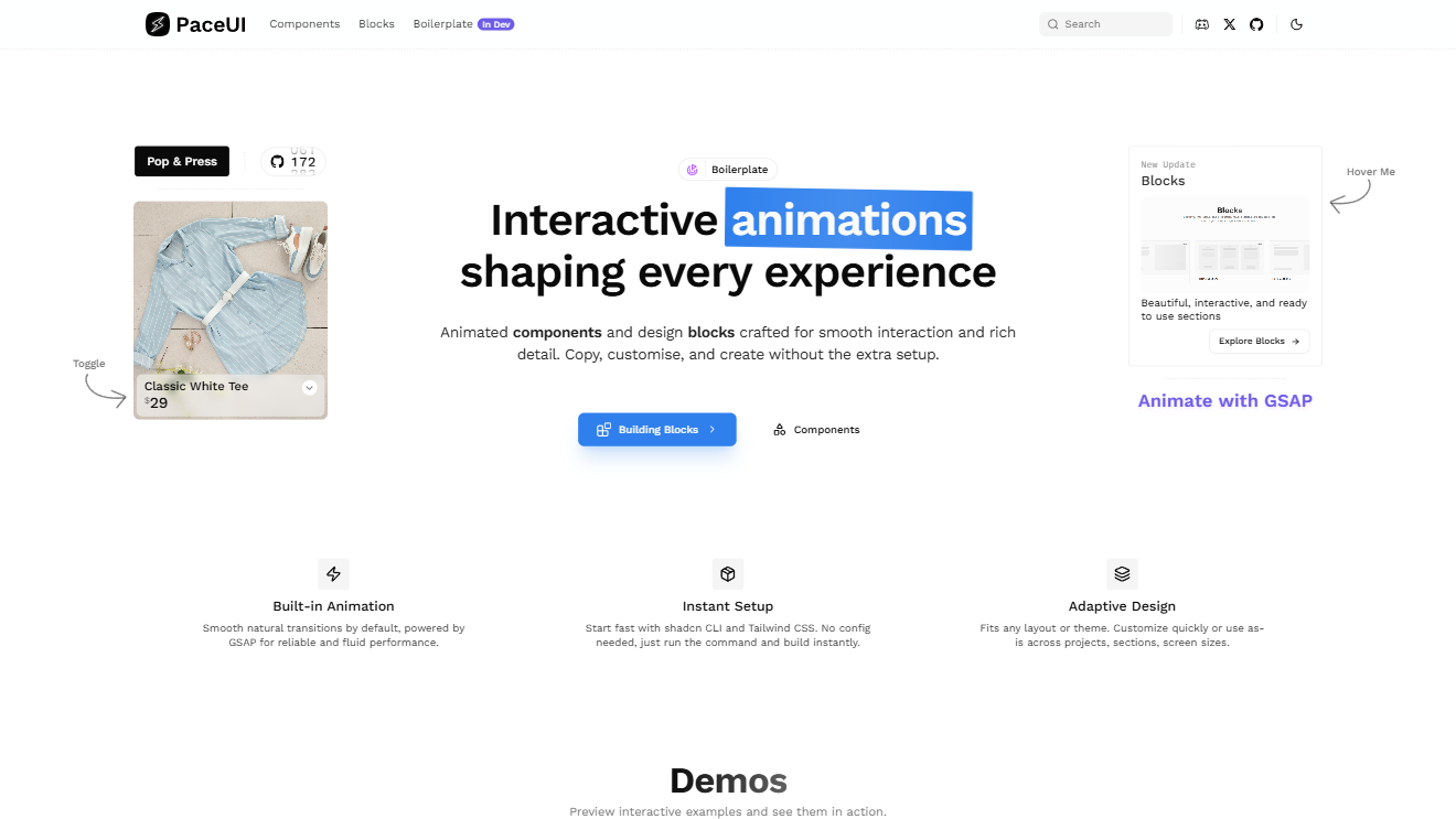
"@paceui-ui": "https://ui.paceui.com/r/{name}.json",
Chinese-focused Shadcn-style UI registry with ready-to-use templates.
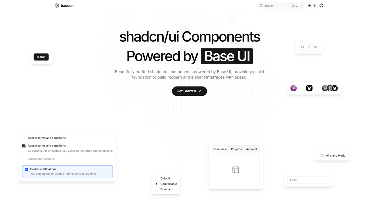
"@basecn": "https://basecn.dev/r/{name}.json",
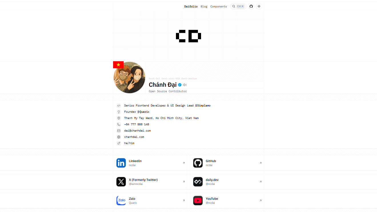
Community-driven UI registry by Chanh Dai with creative design elements.
"@ncdai": "https://chanhdai.com/r/{name}.json",
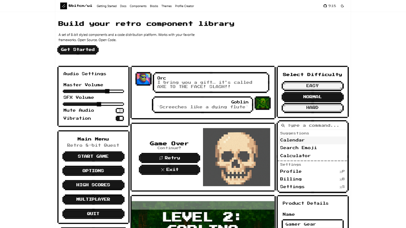
Retro pixel-inspired UI registry with playful, 8-bit style components.
"@8bitcn": "https://8bitcn.com/r/{name}.json",
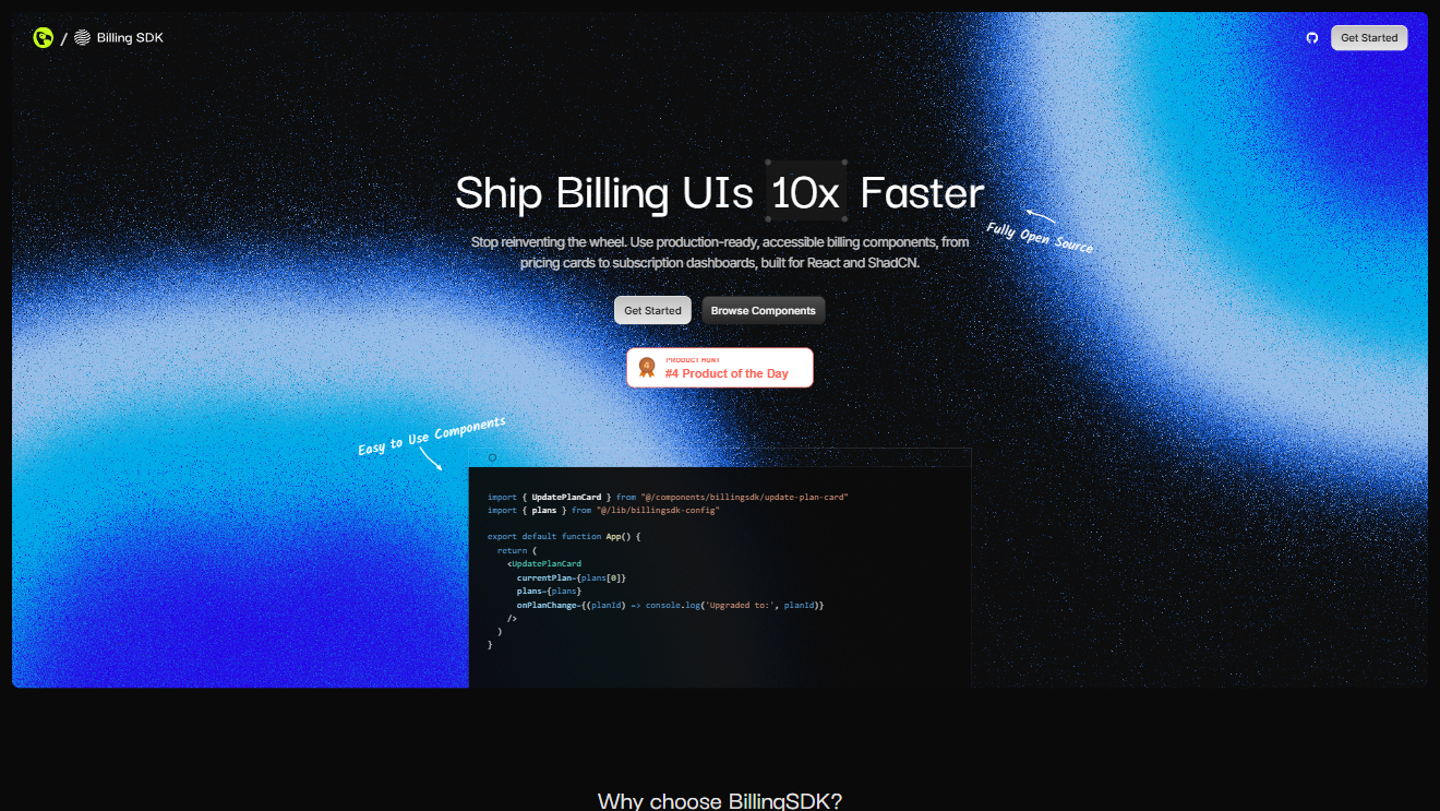
Registry of UI components for billing, payments, and financial interfaces.
"@billingsdk": "https://billingsdk.com/r/{name}.json",
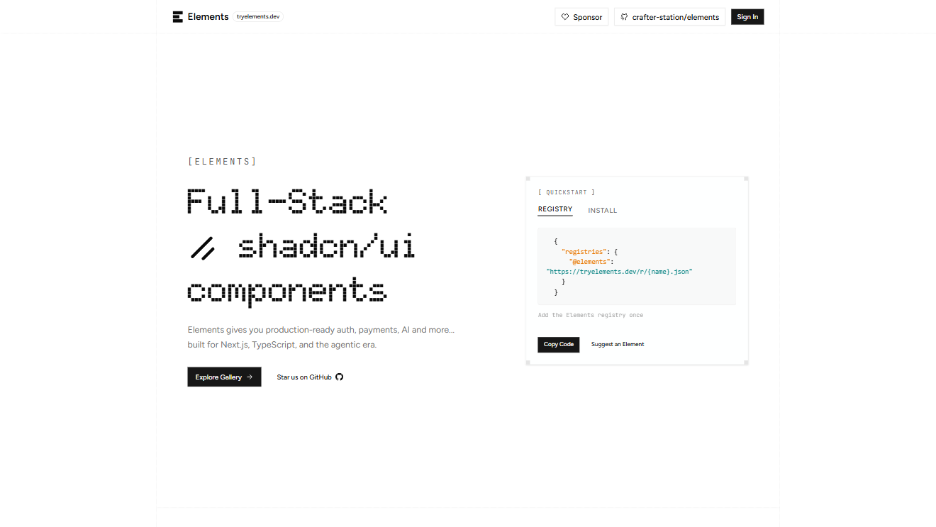
TryElements.dev registry offering clean, reusable UI components.
"@elements": "https://tryelements.dev/r/{name}.json",
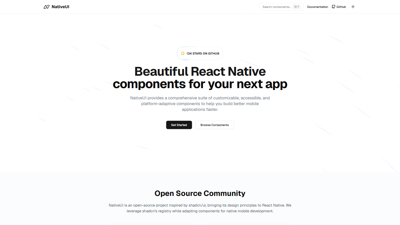
Cross-platform registry of UI components designed for native-like experiences.
"@nativeui": "https://nativeui.io/registry/{name}.json",
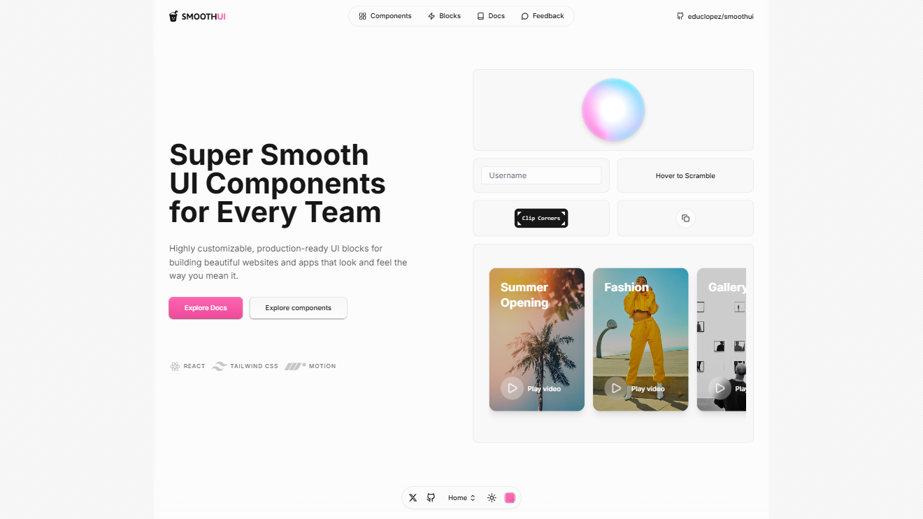
Registry of smooth, animated components for sleek modern web apps.
"@smoothui": "https://smoothui.dev/r/{name}.json",
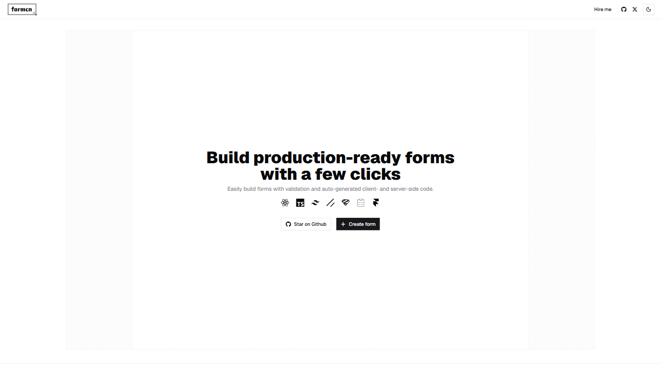
Specialized registry for form components, inputs, and UI patterns.
"@formcn": "https://formcn.dev/r/{name}.json",

Creative UI registry offering playful, colorful components for modern apps.
"@limeplay": "https://limeplay.winoffrg.dev/r/{name}.json",
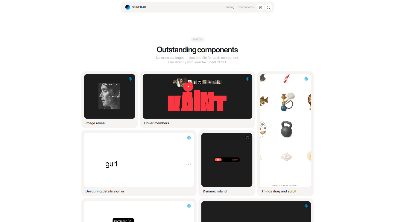
Growing collection of Shadcn-based React/Next.js components for rapid MVPs.
"@skiper-ui": "https://skiper-ui.com/registry/{name}.json",

shadcn-editor rich text editor is the React component that eliminates complex setup. Built with Lexical and shadcn/ui, trusted by 900+ developers.
"@shadcn-editor": "https://shadcn-editor.vercel.app/r/{name}.json",

RigidUI is a React/TypeScript component library featuring sophisticated, battle-tested components like Currency Manager, Draggable Dashboard, and File Explorer built for developers who need complex UI patterns.
"@rigidui": "https://rigidui.com/r/{name}.json",
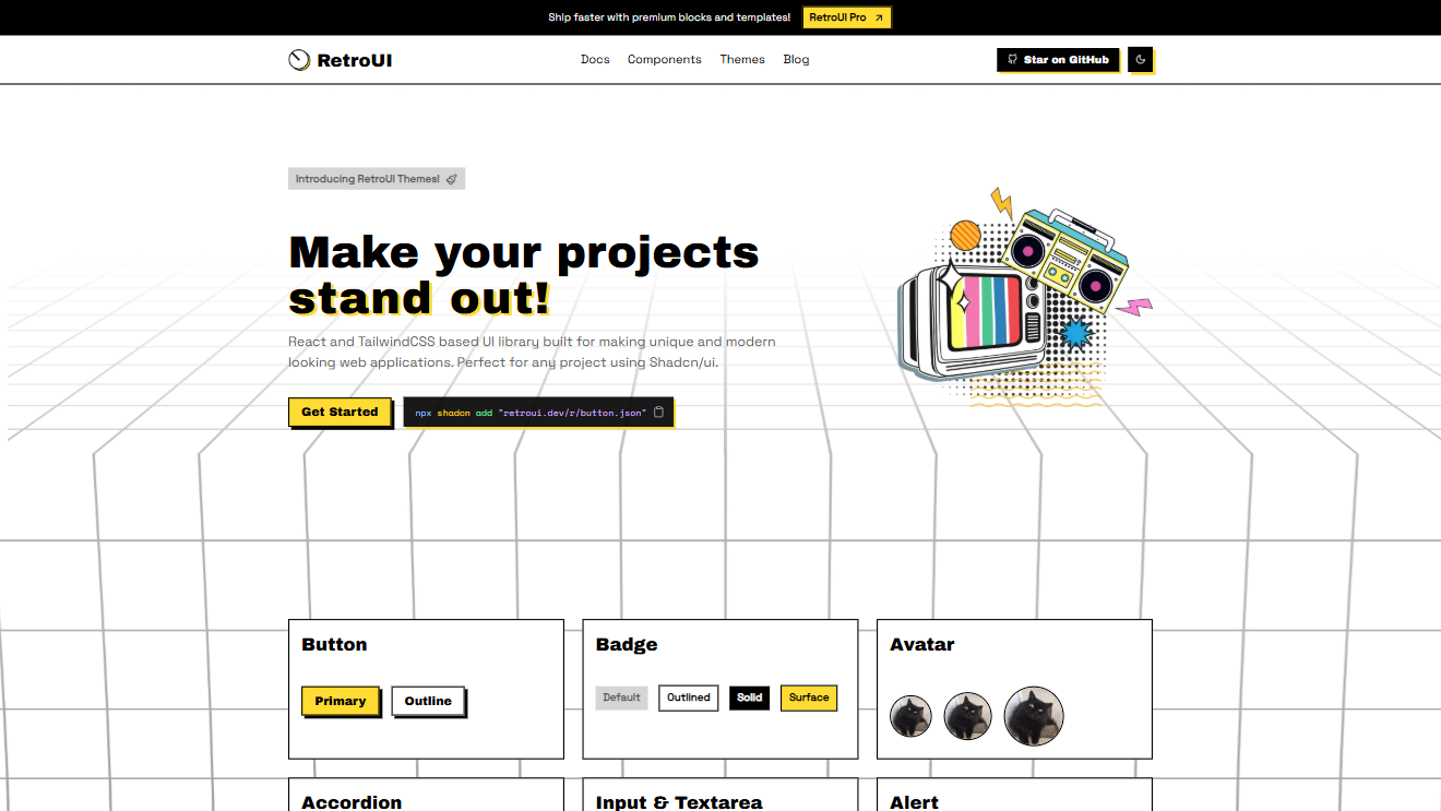
Vintage-inspired Shadcn registry with nostalgic design motifs and early web aesthetics.
"@retroui": "https://retroui.dev/r/{name}.json",
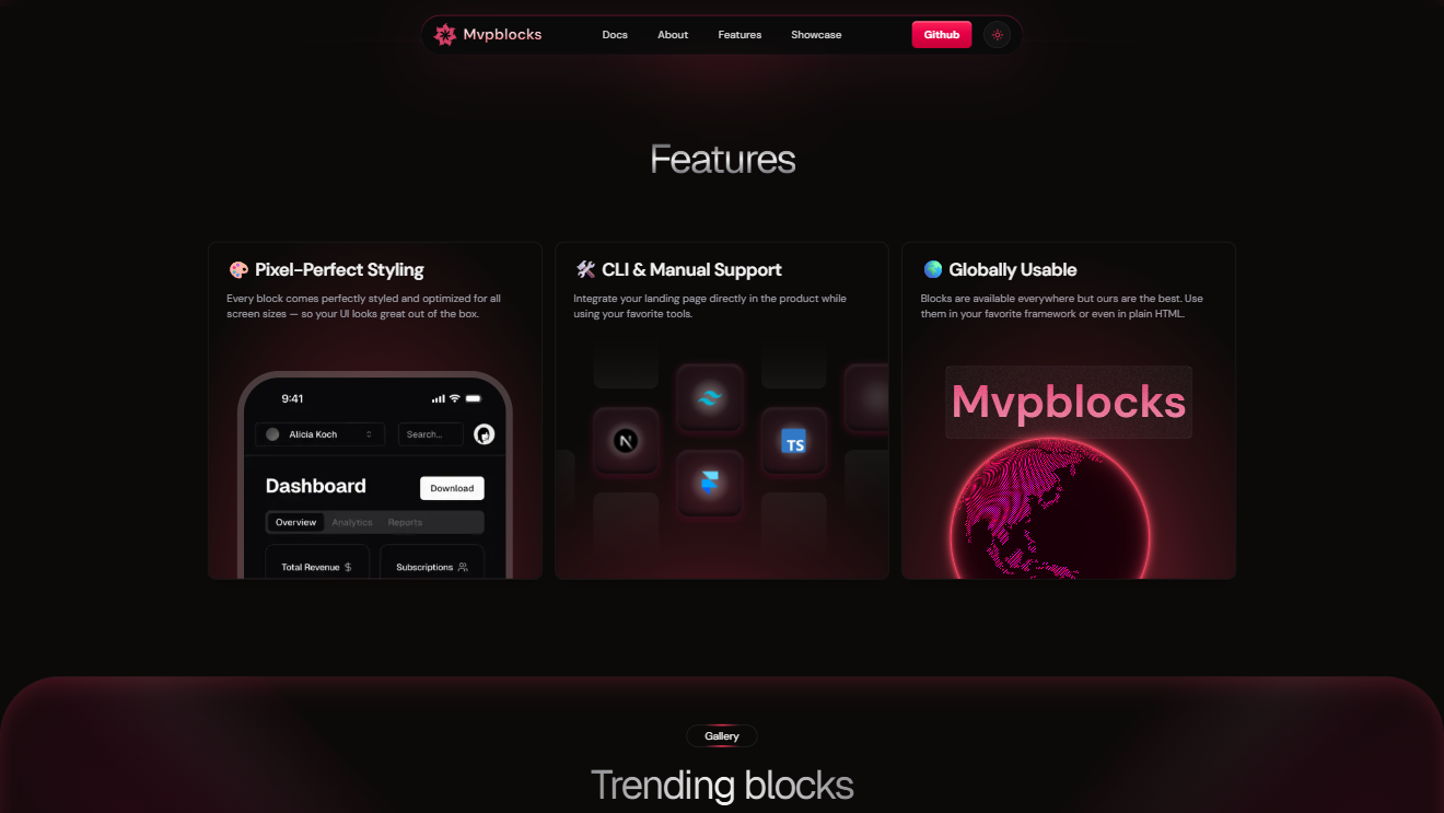
Open-source toolkit for rapid MVPs with responsive blocks and templates for SaaS, e-commerce, and dashboards.
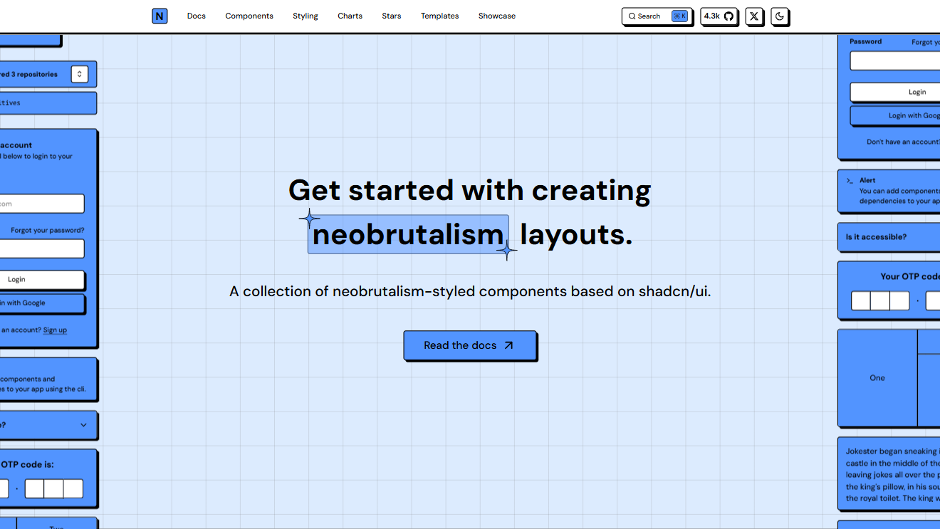
Registry with bold neo-brutalist UI styles, raw layouts, and nostalgic skeuomorphic design.
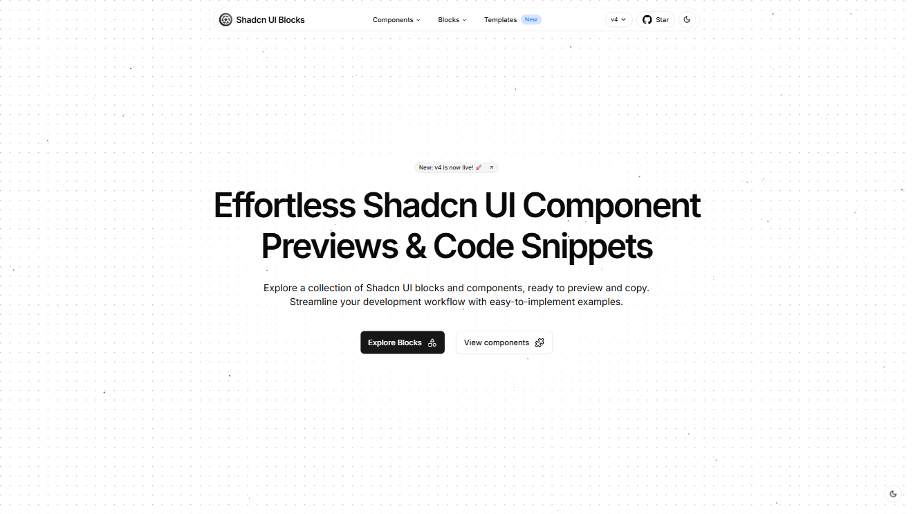
Pre-designed blocks with official Shadcn components for fast prototyping and layouts.
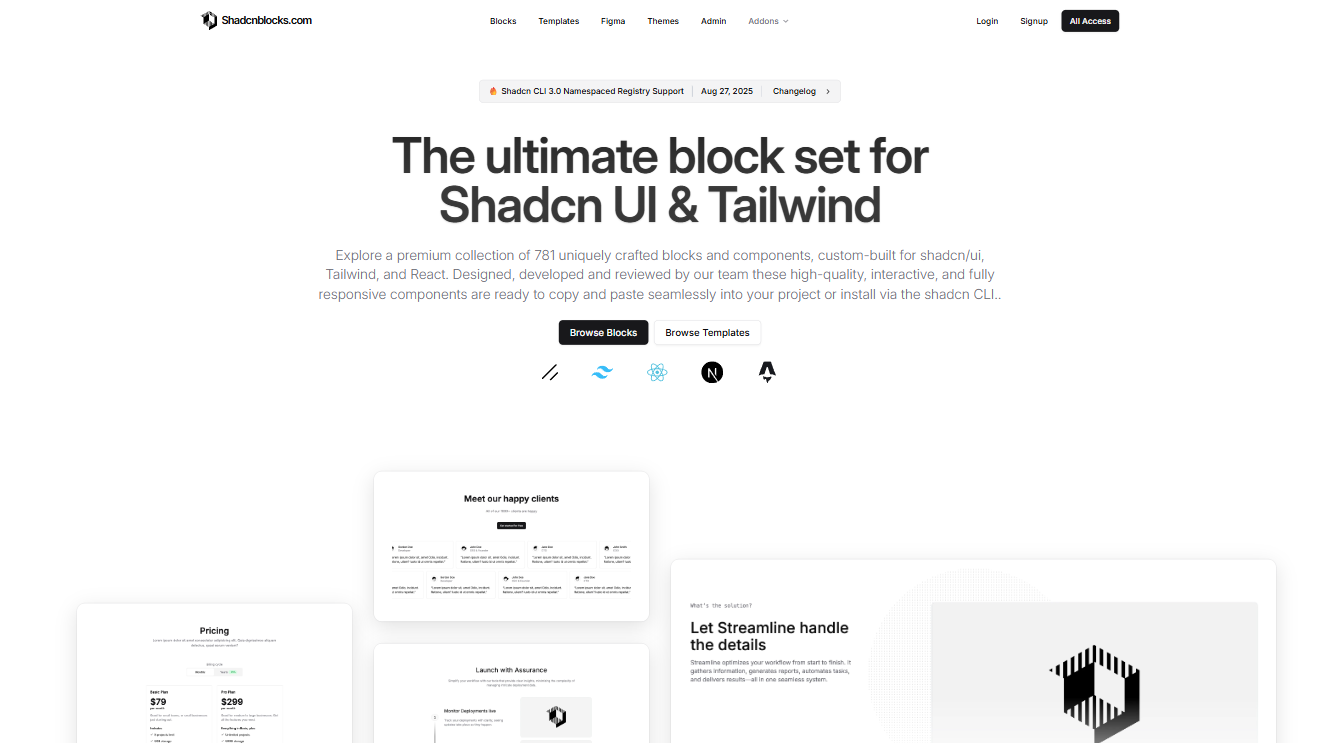
Community-driven collection of reusable Shadcn UI blocks for accessible design.
"@shadcnblocks": "https://shadcnblocks.com/r/{name}.json",
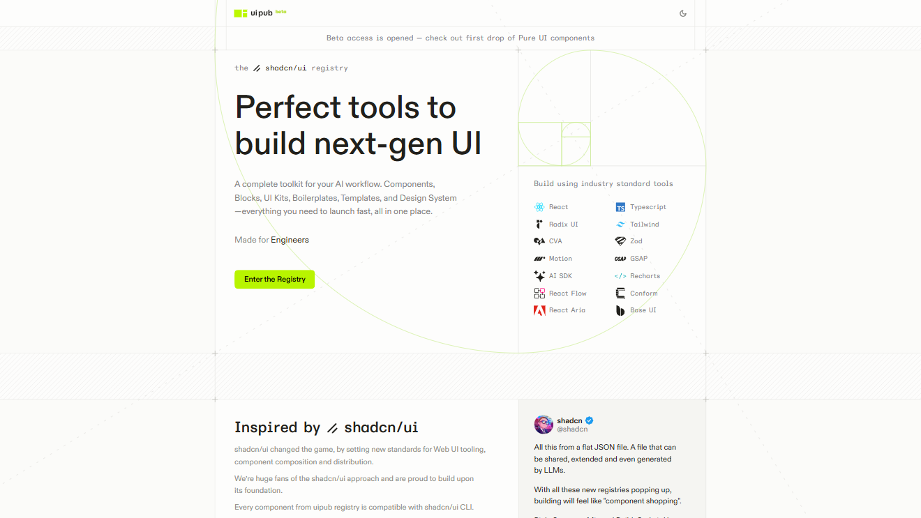
Canonical Shadcn UI registry with Radix + Tailwind components and best practices.
Minimal Shadcn-inspired registry focusing on clean, professional dashboards and content apps.
AI-powered component/block generation aligned with Shadcn standards.
Public registry aggregating community-built Shadcn components and templates.

Windows 95 Styled Components bring retro Win95 aesthetics to React apps, offering pixel-perfect, nostalgic UI elements for fast, fun, and fully customizable interfaces.
"@97cn": "https://97cn.itzik.co/r/{name}.json",

Assistant-UI enables fast, scalable chat interfaces with streaming, accessibility, and Tailwind/shadcn/ui support—trusted by 1,000+ Discord members and 6,600+ GitHub stars, compatible with AI SDKs and custom backends.
"@assistant-ui": "https://r.assistant-ui.com/{name}.json",

Better Upload enables seamless direct-to-S3 file uploads with shadcn/ui components, full data control, and plug-and-play integration for fast, scalable, backend-free deployments.
"@better-upload": "https://better-upload.com/r/{name}.json",

COSS.com unifies infrastructure—email, SMS, calendar, video, notifications—into one npm install with a single COSS_KEY, enabling faster, cheaper, scalable app deployment on Cal.com’s trusted open-source foundation.
"@coss": "https://coss.com/ui/r/{name}.json",

ElevenLabs UI is an open-source React audio components library with voice AI, Matrix visualizations, and Mic Selector controls, enabling fast, customizable, professional voice-enabled apps with seamless ElevenLabs API integration.
"@elevenlabs-ui": "https://ui.elevenlabs.io/r/{name}.json",

Fancy Components is a React animation library with physics-based and interactive microinteractions, Tailwind & TypeScript support, enabling engaging, fully customizable UIs—trusted by 2.4k GitHub stars and built on Motion.
"@fancy": "https://fancycomponents.dev/r/{name}.json",

React component library Intent UI accelerates app development with 400+ pre-built blocks and 1,191 icons, offering full customization, zero setup, and trusted by Next.js and Laravel developers.
"@intentui": "https://intentui.com/r/{name}",

ScrollX UI is a React component library with composable, accessible patterns and AI-ready design, enabling fast, consistent UIs for startups and enterprise apps with zero vendor lock-in.
"@scrollxui": "https://www.scrollxui.dev/registry/{name}.json",

Shadcn-map is a Leaflet-based React component bringing consistent, interactive maps with OpenStreetMap, custom markers, and Tailwind-styled popups to shadcn UI projects for fast, scalable deployment.
"@shadcn-map": "http://shadcn-map.vercel.app/r/{name}.json",

Shadcn Studio transforms generic UIs into branded, production-ready interfaces with 550+ blocks, AI theme generation, Tailwind v4, and motion components for fast, fully customizable design workflows.
"@shadcn-studio": "https://shadcnstudio.com/r/{name}.json",

Supabase is an open-source Postgres platform with Auth, Edge Functions, and Realtime, enabling scalable, production-ready apps faster than Firebase, trusted by companies scaling to millions.
"@supabase": "https://supabase.com/ui/r/{name}.json",

SVGL is an SVG logo library with 400+ brand logos, API access, and integrations for Figma, React, and Svelte, providing designers and developers fast, professional, up-to-date assets.
"@svgl": "https://svgl.app/r/{name}.json",

Tweakcn is a visual shadcn theme editor with AI generation and real-time preview, enabling fully customized, accessible interfaces for React and Next.js without touching code.
"@tweakcn": "https://tweakcn.com/r/themes/{name}.json",

WDS Shadcn Registry is an accessible component library extending shadcn UI with async-ready buttons, multi-selects, and production-ready patterns for faster, scalable, community-driven development.
"@wds": "https://wds-shadcn-registry.netlify.app/r/{name}.json",

Zippystarter is a React template library with MDX-powered responsive blocks and starter templates, letting developers launch polished websites quickly with Tailwind, shadcn, and Next.js.
"@zippystarter": "https://zippystarter.com/r/{name}.json",

HA Components is an open-source React and Tailwind UI library for building fully customizable, production-ready Home Assistant dashboards with pre-built smart home controls.
"@ha-components": "https://hacomponents.keshuac.com/r/{name}.json"
Shadcn UI Registries: A Comprehensive Guide
Shadcn registries are centralized repositories that store and manage UI components for the shadcn framework. They enable developers to add, update, and distribute custom or official components across projects. The official shadcn registry is hosted at ui.shadcn.com, and developers can also create their own custom registries or use third-party registries to extend their component libraries.
The Shadcn MCP Server
Use the shadcn MCP server to browse, search, and install components from registries.
The shadcn MCP Server allows AI assistants to interact with items from registries. You can browse available components, search for specific ones, and install them directly into your project using natural language.
For example, you can ask an AI assistant to "Build a landing page using components from the acme registry" or "Find me a login form from the shadcn registry".
Registries are configured in your project's components.json file.
  "registries": {
    "@acme": "https://acme.com/r/{name}.json"
  }
What is MCP?
Model Context Protocol (MCP) is an open protocol that enables AI assistants to securely connect to external data sources and tools. With the shadcn MCP server, your AI assistant gains direct access to:
- Browse Components - List all available components, blocks, and templates from any configured registry
- Search Across Registries - Find specific components by name or functionality across multiple sources
- Install with Natural Language - Add components using simple conversational prompts like "add a login form"
- Support for Multiple Registries - Access public registries, private company libraries, and third-party sources
How It Works
The MCP server acts as a bridge between your AI assistant, component registries and the shadcn CLI.
- Registry Connection - MCP connects to configured registries (shadcn/ui, private registries, third-party sources)
- Natural Language - You describe what you need in plain English
- AI Processing - The assistant translates your request into registry commands
- Component Delivery - Resources are fetched and installed in your project
Supported Registries
The shadcn MCP server works out of the box with any shadcn-compatible registry.
- shadcn/ui Registry - The default registry with all shadcn/ui components
- Third-Party Registries - Any registry following the shadcn registry specification
- Private Registries - Your company's internal component libraries
- Namespaced Registries - Multiple registries configured with @namespace syntax
Quick Start
Select your MCP client and follow the instructions to configure the shadcn MCP server. If you'd like to do it manually, see the Configuration section.
Run the following command in your project:
pnpm dlx shadcn@latest mcp init --client claudeRestart your MCP client and try the following prompts:
- Show me all available components in the shadcn registry
- Add the button, dialog and card components to my project
- Create a contact form using components from the shadcn registry
Note: You can use /mcp command in your client to debug the MCP server.
Configuration
You can use any MCP client to interact with the shadcn MCP server. Here are the instructions for the most popular ones.
Claude Code
To use the shadcn MCP server with Claude Code, add the following configuration to your project's .mcp.json file:
  "mcpServers": {
    "shadcn": {
      "command": "npx",
      "args": ["shadcn@latest", "mcp"]
    }
  }
After adding the configuration, restart Claude Code and run /mcp to see the shadcn MCP server in the list. If you see Connected, you're good to go.
See the Claude Code MCP documentation for more details.
Cursor
To configure MCP in Cursor, add the shadcn server to your project's .cursor/mcp.json configuration file:
  "mcpServers": {
    "shadcn": {
      "command": "npx",
      "args": ["shadcn@latest", "mcp"]
    }
  }
After adding the configuration, enable the shadcn MCP server in Cursor Settings.
Once enabled, you should see a green dot next to the shadcn server in the MCP server list and a list of available tools.
See the Cursor MCP documentation for more details.
VS Code
To configure MCP in VS Code with GitHub Copilot, add the shadcn server to your project's .vscode/mcp.json configuration file:
  "mcpServers": {
    "shadcn": {
      "command": "npx",
      "args": ["shadcn@latest", "mcp"]
    }
  }
After adding the configuration, open .vscode/mcp.json and click Start next to the shadcn server.
See the VS Code MCP documentation for more details.
Configuring Registries
The MCP server supports multiple registries through your project's components.json configuration. This allows you to access components from various sources including private registries and third-party providers.
Configure additional registries in your components.json:
  "registries": {
    "@acme": "https://registry.acme.com/{name}.json",
    "@internal": {
      "url": "https://internal.company.com/{name}.json",
      "headers": {
        "Authorization": "Bearer ${REGISTRY_TOKEN}"
      }
    }
  }
Note: No configuration is needed to access the standard shadcn/ui registry.
Authentication
For private registries requiring authentication, set environment variables in your .env.local:
REGISTRY_TOKEN=your_token_here
API_KEY=your_api_key_here
For more details on registry authentication, see the Authentication documentation.
Example Prompts
Once the MCP server is configured, you can use natural language to interact with registries. Try one of the following prompts:
Browse & Search
- Show me all available components in the shadcn registry
- Find me a login form from the shadcn registry
Install Items
- Add the button component to my project
- Create a login form using shadcn components
- Install the Cursor rules from the acme registry
Work with Namespaces
- Show me components from acme registry
- Install @internal/auth-form
- Build me a landing page using hero, features and testimonials sections from the acme registry
Using Third-Party Registries with the MCP Server
To use third-party registries with the MCP server:
- Add the third-party registry URL to your project's
components.jsonconfiguration file. - The MCP server automatically supports any shadcn-compatible registry without special setup.
- You can interact with components from multiple registries using natural language commands or CLI with namespaced formats like
@registry/component-name. - Private registries can be configured with authentication via environment variables.
- The MCP server resolves dependencies and installs components seamlessly from the correct registries.
Troubleshooting
MCP Not Responding
If the MCP server isn't responding to prompts:
- Check Configuration - Verify the MCP server is properly configured and enabled in your MCP client
- Restart MCP Client - Restart your MCP client after configuration changes
- Verify Installation - Ensure shadcn is installed in your project
- Check Network - Confirm you can access the configured registries
Registry Access Issues
If components aren't loading from registries:
- Check components.json - Verify registry URLs are correct
- Test Authentication - Ensure environment variables are set for private registries
- Verify Registry - Confirm the registry is online and accessible
- Check Namespace - Ensure namespace syntax is correct (@namespace/component)
Installation Failures
If components fail to install:
- Check Project Setup - Ensure you have a valid components.json file
- Verify Paths - Confirm the target directories exist
- Check Permissions - Ensure write permissions for component directories
- Review Dependencies - Check that required dependencies are installed
No Tools or Prompts
If you see the No tools or prompts message, try the following:
- Clear the npx cache - Run
npx clear-npx-cache - Re-enable the MCP server - Try to re-enable the MCP server in your MCP client
- Check Logs - In Cursor, you can see the logs under View -> Output and select MCP: project-* in the dropdown.
In Summary
Shadcn registries are centralized or custom-hosted collections of UI components for shadcn. The shadcn MCP server is a powerful tool enabling AI-assisted interaction with these registries, allowing seamless browsing, searching, and installation using natural language. By configuring multiple registries in components.json and setting up authentication, you can access public, private, and third-party components effortlessly. With support for various MCP clients and comprehensive troubleshooting, managing UI components becomes modular, scalable, and integrated into your development workflow.