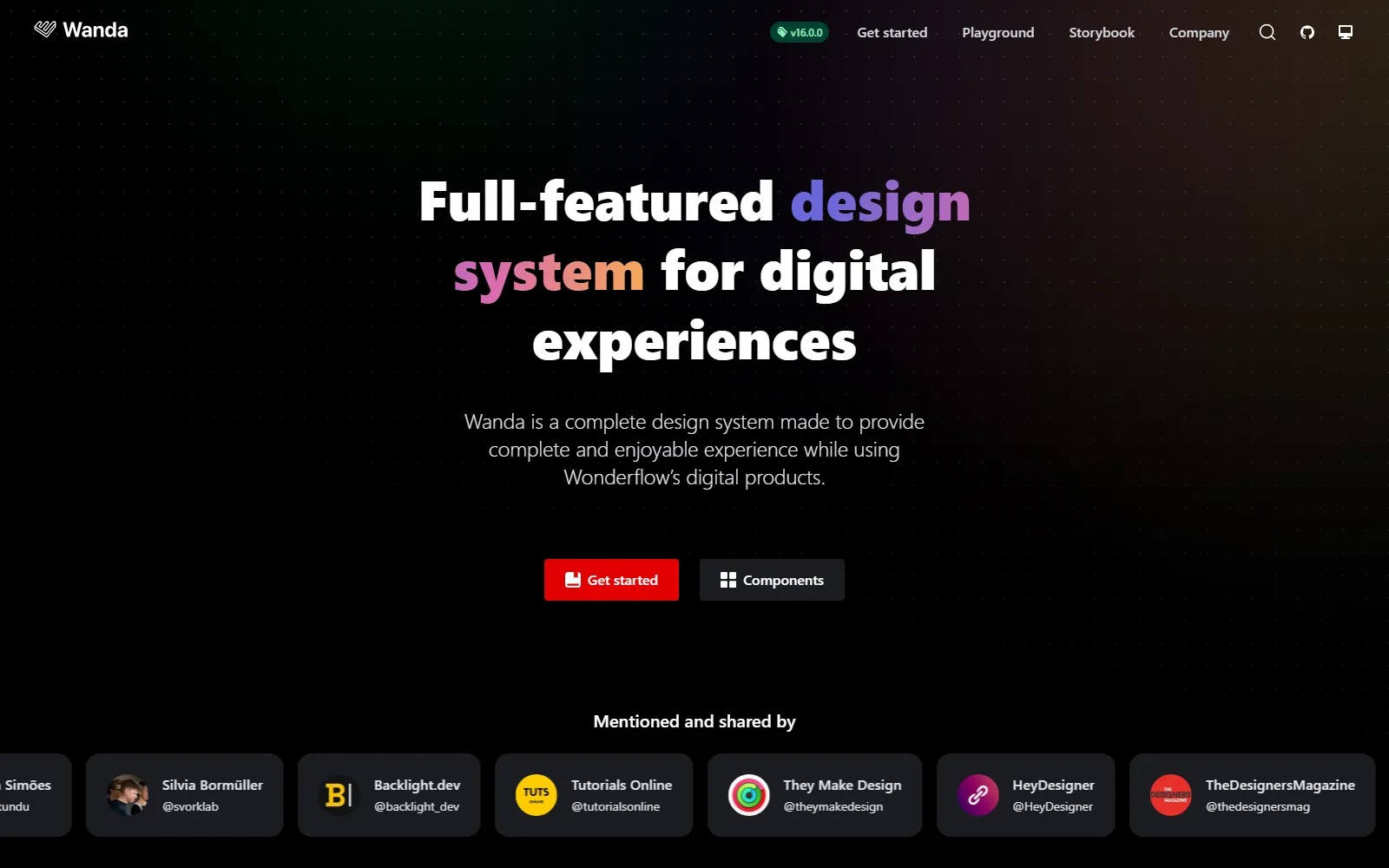
Create complete, enjoyable digital product experiences with comprehensive React framework. Built for product teams and digital developers, this open-source framework combines 26 React components with design tokens so you can build digital products faster, while accessibility-first principles and modular architecture enable consistent branding without development overhead. This runs on a platform trusted by global corporations like DHL Braun Colgate Philips, ensuring every project ships faster, looks sharper, and scales effortlessly through scalable flexible components.
-
 Seeds by Sprout Social Streamline creative workflows with comprehensive brand hub and visual pattern library. Guidelines and writing standards trusted by social media teams. seeds.sproutsocial.com
-
 Apple HIG by Apple Create consistent user interfaces for iOS, macOS, watchOS, and tvOS apps. Comprehensive guidelines trusted by 5M+ developers worldwide for seamless Apple. developer.apple.com
-
 Ahoy by Teamleader Create consistent business software experiences with specialized B2B framework. Component library and design tokens optimized for professional interface. ahoy.teamleader.design
-
 WPDS by Washington Post Create consistent digital media experiences with specialized newsroom framework. React components and design tokens for professional journalism platforms. build.washingtonpost.com
-
 Carbon by IBM Transform enterprise software development with comprehensive open-source components. Professional-grade framework trusted by millions of developers. carbondesignsystem.com
-
 Helix by Ideagen Create unified pharmaceutical digital experiences with comprehensive component library. 650+ specialized components trusted by 150+ healthcare products. helixdesignsystem.github.io
Get the new ones by email
A short email when something is added to the directory.