Design Systems
Resources, tools, and inspiration for building, maintaining, and scaling design systems.
63 tools
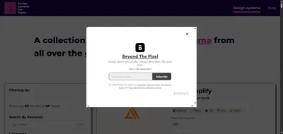

Design System For Figma
Design Systems for Figma, the design system gallery, is the tool that ends design-dev gaps. Explore real systems from Uber & IBM, complete with Figma kits.
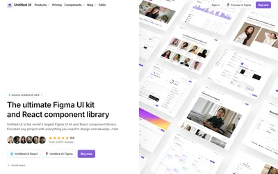

Untitled UI
The world's largest Figma UI kit with 10,000+ components designed to eliminate design bottlenecks. Trusted by 280,000+ designers worldwide for faster.
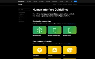

Apple HIG by Apple
Create consistent user interfaces for iOS, macOS, watchOS, and tvOS apps. Comprehensive guidelines trusted by 5M+ developers worldwide for seamless Apple.
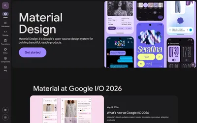

Material Design by Google
Build beautiful user interfaces with open-source components and modern design principles. Trusted by millions of developers for consistent, accessible web.
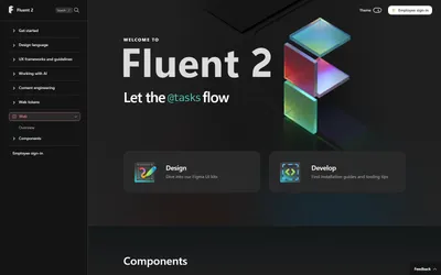

Fluent 2 by Microsoft
Create beautiful cross-platform applications with comprehensive UI components. Trusted by millions of developers worldwide for consistent Microsoft.
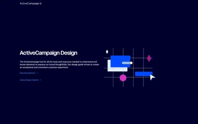

Camp by ActiveCampaign
Transform email creation into consistent visual experiences with 28 marketing-focused components. Built for marketers across 17 directories for.
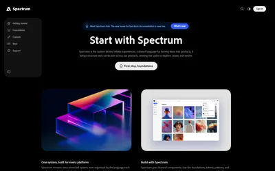

Spectrum by Adobe
Transform complex interface work into cohesive user experiences with comprehensive design components. Professional-grade toolkit for consistent creative.
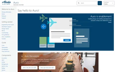

Auro by Alaska Airlines
Ensure consistent digital experiences across multiple platforms with airline-focused components. Trusted by 45-person design team for seamless travel.
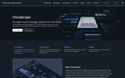

Cloudscape by Amazon
Transform complex cloud interfaces into intuitive user experiences with 60+ specialized components. Build powerful web applications trusted by AWS teams.
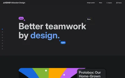

Atlassian Design System by Atlassian
Transform complex product development into consistent interface experiences. Build productivity apps like Jira and Confluence, trusted by 1,000+ designers.


Audi Design System by Audi
Audi's UI guidelines on its corporate identity hub: experience principles, responsive UI, themes, motion, UI components and an icon library.
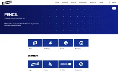

Pencil by Brainly
Transform complex learning interfaces into consistent educational experiences. Build engaging learning apps trusted by 250M+ users worldwide.


Cash App Design System by Cash App
Evergreen design guidelines powering fintech platforms for secure peer payments. Modern UI/UX trusted by millions for seamless financial experiences.
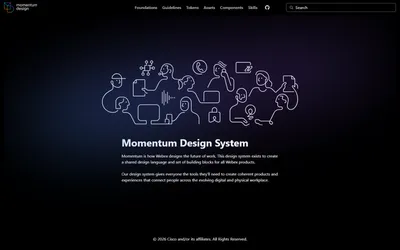

Momentum Design by Cisco
Empower collaboration apps with cohesive digital experiences. UI system trusted by 150+ designers, saving tens of thousands of development hours.
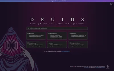

Druids by Datadog
Streamline monitoring product UI with scalable design platform. 600+ internal components trusted by global teams for consistent data visualization.
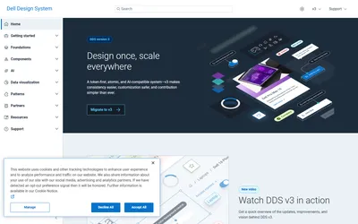

Dell Design System by Dell
Ensure accessible digital experiences with unified UI components. 34 components across 11 directories, trusted by 100+ product teams for enterprise.
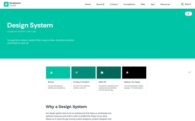

Watson by Docplanner
Ensure seamless healthcare experiences with specialized UI/UX design. 31 medical components across 10 directories for trusted healthcare SaaS platforms.
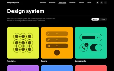

Evo by eBay
Transform e-commerce interface development with comprehensive marketplace components. 32 components, 16 directories, and 300+ page development playbook.
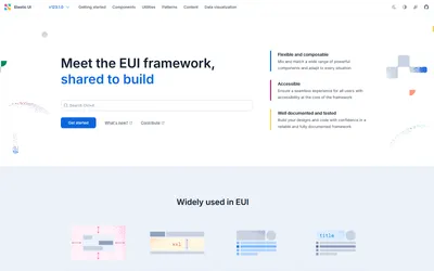

Elastic Design System by Elastic
Transform React interface development with professional UI components framework. 37+ components for building powerful search and analytics applications.

Calcite by Esri
Create beautiful web components for consistent mapping applications. 35 specialized components trusted by geographic information system developers.

Edison by General Electric
Transform complex medical interface development with award-winning healthcare components. 33 specialized components trusted globally by medical.
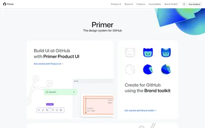

Primer by GitHub
Power developer interface development with open-source React components. 40+ components trusted by millions of developers for consistent coding.
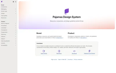

Pajamas by GitLab
Create unified DevOps interface development with open-source components. 34 components across 19 directories, trusted by millions of developers worldwide.
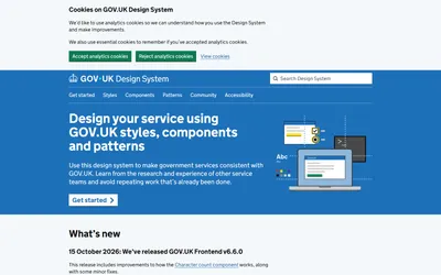

GOV.UK Design System by UK Government
Transform government digital services with consistent, accessible components. Powers 1,969 live websites and saves £17M annually in development costs.
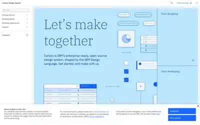

Carbon by IBM
Transform enterprise software development with comprehensive open-source components. Professional-grade framework trusted by millions of developers.
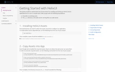

Helix by Ideagen
Create unified pharmaceutical digital experiences with comprehensive component library. 650+ specialized components trusted by 150+ healthcare products.
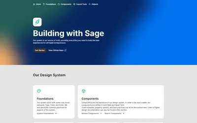

Sage by Kajabi
Transform product development with Rails and React components plus SCSS system. Comprehensive framework trusted by internal development teams for.
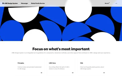

Line Design System by LINE
Ensure unified messenger experiences across global platforms. Comprehensive framework with 25 components across 34 services, trusted by millions worldwide.
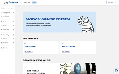

Motion by Michelin
React UI library eliminating inconsistency across productivity applications. Complete Figma files and components trusted by 200+ development teams.
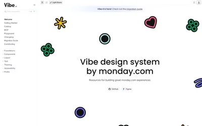

Vibe by Monday.com
Streamline database product development with comprehensive component framework. 28 components and design guides trusted by internal development teams.
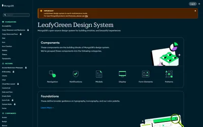

LeafyGreen by MongoDB
Establish common design language for browser websites with comprehensive CSS framework. HTML components trusted by development teams for consistent.
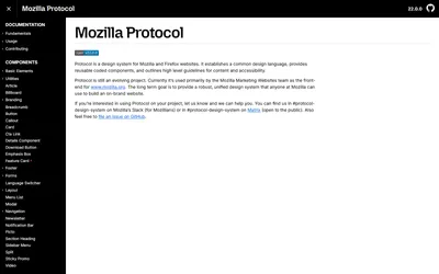

Protocol by Mozilla
Create coherent healthcare digital experiences with specialized web components and design tokens. Framework optimized for medical product development.
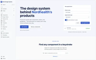

Nordhealth Design System by Nordhealth
Ensure accessible, consistent government digital services with ready-to-use code and comprehensive prototyping kit for public sector development.
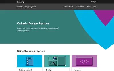

Ontario Design System by Ontario Government
Optimize complex data-dense desktop interfaces with specialized React toolkit. Professional UI components designed for powerful desktop applications.
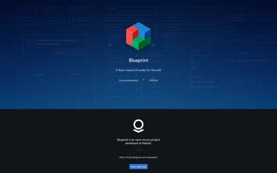

Blueprint by Palantir
React toolkit optimizing complex data-dense desktop interfaces with professional UI components. Enterprise-grade framework for sophisticated desktop.
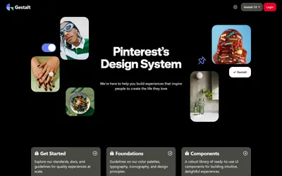

Gestalt by Pinterest
Create consistent social media user experiences with React UI library. 50+ components and Figma resources for engaging visual platform development.
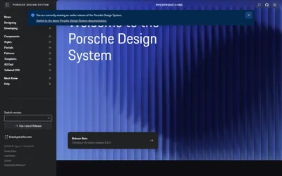

Porsche Design System by Porsche
Create stunning automotive digital experiences with premium web components toolkit. Figma libraries and TypeScript support meeting luxury quality.
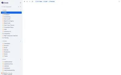

Blade by Razorpay
Streamline fintech product development with React toolkit and specialized payment components. Design tokens and interfaces trusted by financial.
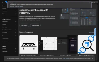

PatternFly by Red Hat
Accelerate enterprise product development with open-source framework. Consistent, scalable components designed for complex business applications and.
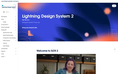

Lightning by Salesforce
Create consistent CRM experiences with enterprise-grade framework. Professional components and design tokens trusted by global sales and service teams.
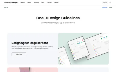

One UI by Samsung
Create consistent mobile experiences with comprehensive Android framework. Optimized components and guidelines trusted for premium mobile platform.


Horizon by ServiceNow
Empower creators to design better enterprise experiences with AI-guided framework. 4 specialized app frameworks trusted by global development teams.
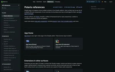

Polaris by Shopify
Create merchant-focused ecommerce experiences with comprehensive React framework. Admin interface components for building trusted online store.
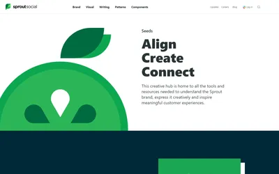

Seeds by Sprout Social
Streamline creative workflows with comprehensive brand hub and visual pattern library. Guidelines and writing standards trusted by social media teams.
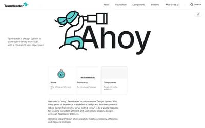

Ahoy by Teamleader
Create consistent business software experiences with specialized B2B framework. Component library and design tokens optimized for professional interface.
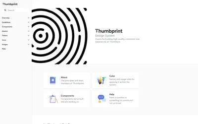

Thumbprint by Thumbtack
Create consistent marketplace experiences with specialized service platform framework. React components and design tokens for trusted local service.
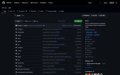

Paste by Twilio
Create consistent communication experiences with comprehensive developer framework. React components and design tokens trusted globally for messaging.
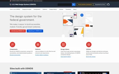

U.S. Web Design System by U.S. Government
Create accessible, mobile-friendly government websites with federal framework. Components, patterns, and design tokens trusted by agencies nationwide.
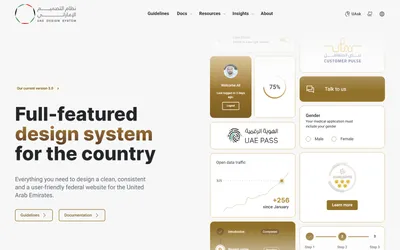

UAE Design System by UAE Government
Create consistent, accessible government website experiences with WCAG 2.2 compliant framework. Modular components trusted by federal government entities.
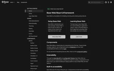

Base by Uber
Create consistent modern web experiences with accessibility-tested React component library. Open-source framework trusted globally for scalable.

Geist by Vercel
Create modern website experiences with minimalist React library. MIT-licensed aesthetic components trusted by developers for clean, professional.

Visa Design System by Visa
Create accessible payment experiences with comprehensive multi-platform framework. React, Angular, and Flutter components trusted by global financial.
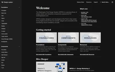

WPDS by Washington Post
Create consistent digital media experiences with specialized newsroom framework. React components and design tokens for professional journalism platforms.
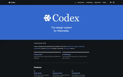

Codex by Wikimedia
Create consistent knowledge-sharing experiences with accessibility-first Vue framework. Open-source components trusted by global contributor communities.
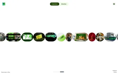

Wise Design System by Wise
Create accessible, consistent money transfer experiences with award-winning fintech framework. Global UI components recognized by D&AD for design.
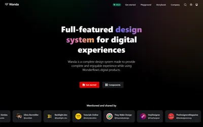

Wanda by Wonderflow
Create complete, enjoyable digital product experiences with comprehensive React framework. Open-source components and design tokens trusted globally.
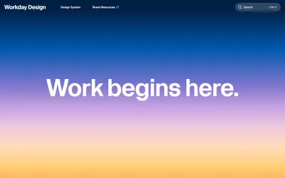

Canvas by Workday
Create consistent, accessible enterprise applications with comprehensive open-source framework. Professional components and design tokens trusted by.
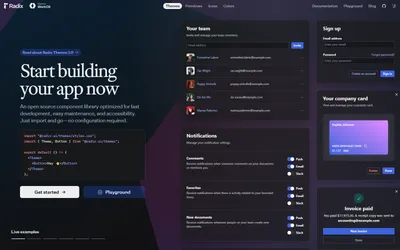

Radix by WorkOS
Create accessible, high-quality web applications with headless React primitives library. MIT-licensed components featuring flexible, customizable.
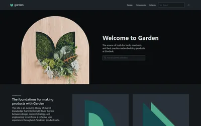

Garden by Zendesk
Create accessible, consistent user interfaces with WCAG-compliant open-source framework. React components trusted by customer service and support teams.
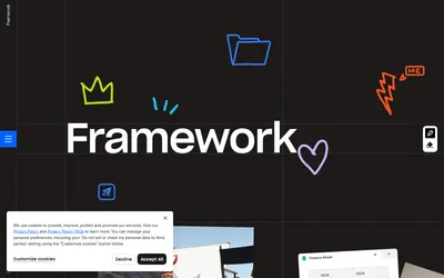

Design system by Dropbox
Simplify modern work chaos with interactive brand framework emphasizing humanity, clarity, action, and delight. Comprehensive guidelines trusted by.
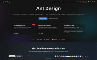

Ant Design by Alibaba
Enterprise-class React UI library with 90+ professional components. Developer-focused framework trusted by millions globally including major technology.
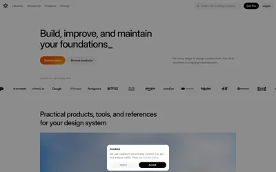

Design System Surf
Design Systems Surf design system database is the curated platform that transforms component research into scalable solutions. Browse 70+ systems, trusted.
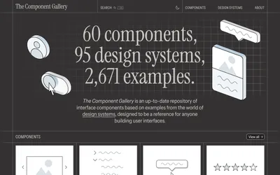

Component gallery
Component Gallery UI component library inspiration is the curated repository that transforms scattered design system hunts into focused creativity.
Every category, with its count
The whole directory, in one view.
Get the new ones by email
A short email when something is added to the directory.